CRM Record Data Density
The record page (shown above, a ‘profile’ page for CRM objects such as contacts, companies, and deals) is the heart of HubSpot’s CRM, which is the heart of its platform. With over 100 million page views per month, it is the most visited page in HubSpot, serving as the nexus for an object’s properties, activity, related objects, tools, and apps.
The Challenge: Sales and support reps, who are evaluated largely by time- and quantity- related metrics, are spending too long simply trying to access their information due to the organization and layout of the record page’s components. It took our sales users a median of almost eight minutes to respond to a call or email after opening a record. These users need to be able to see more data at a glance so that they can make faster decisions on how to proceed with their clients.
Solving for: Primarily sales reps, but also support and service reps
Role: Product designer collaborating with product management and engineering on the CRM Record and Events teams, utilizing previous research conducted by our CRM UX researchers
Success is measured by: CSAT survey responses, change in NPS regarding activity timeline, change in weekly search usage rate, change in search usage retention rate, time spent per comment creation
Our main goal with this redesign was to give users more agency over where they put their focus through a simpler, more scannable presentation of data with less visual noise.
We handled this full page design update in two phases, based on their corresponding development teams.
In collecting data to inform our design decisions on this project, we realized we didn’t have many usage analytics available for the record as a whole. We had a huge amount of qualitative data for the timeline so we started our redesign there, and put analytics in place on our sidebars so that we could collect data during the timeline design process to inform the second phase of our designs.
Activity (middle) section:
The original layout for the record page is shown below.
Standard laptop users could only see an average of 1-3 activities on our timeline at once, which made it difficult to get a well-rounded impression of any recent touchpoints without excessive scrolling and sorting through available data.
A frequent workaround users engaged in is shown here: they would often create a note and pin it to the top of the page so they could write a summary of recent engagements to try to save time scrolling and figuring it out. Users would have to keep this updated, which was additional work for them, and sometimes caused confusion when multiple salespeople were working with the same record.
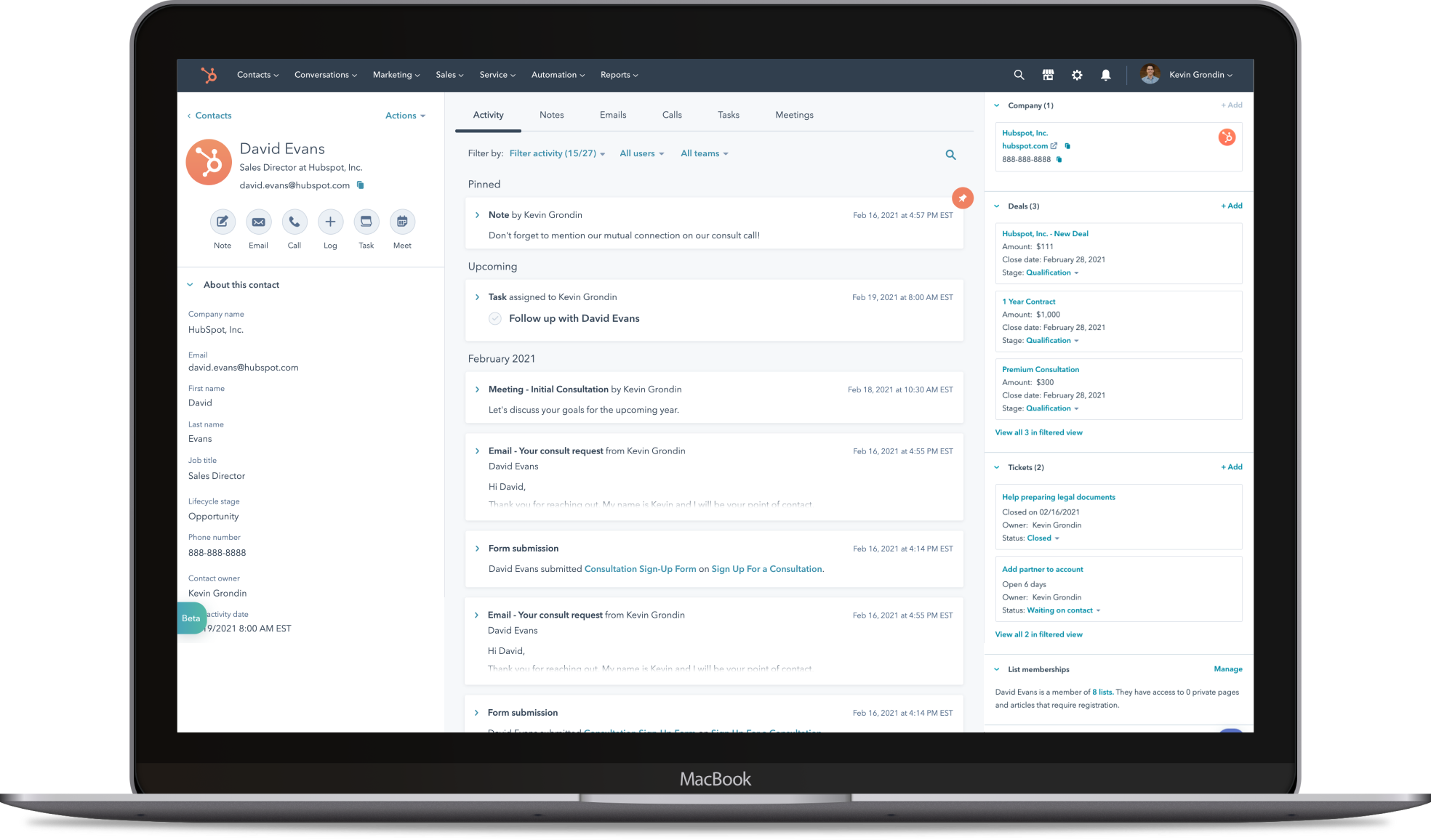
Original CRM record page in February. Screenshot taken on a 13” laptop.
I began our timeline design phase, in addition to reviewing the qualitative interview and research data I mentioned previously, with a thorough audit of the almost 40 activity types available on our record timeline. In addition to concerns about whitespace, data density, and high priority placement of low priority information, I found significant pattern discrepancies across our activities:
Several different presentations of the people involved in activities
Links with the same treatment leading externally, to panels on the page, or internally within HubSpot, giving the user an unpredictable navigation experience
Timestamps displayed in several different ways
Twenty-three unique icons among our various activity types, and several activity types represented by the same generic placeholder icon
If icons aren’t easily identifiable, they begin to act solely as decoration with little functional purpose and contribute to visual noise
While we wanted to put appropriate focus on removing unnecessary information and decoration, we also wanted to make sure that the right information was available at a glance. From our existing research and previously collected information, we knew that our sales and support users were looking to quickly answer the following questions when they landed on a record page for a client:
How long have they been a customer?
How did they hear about our business?
Has this customer been in touch with anyone on our team?
What was the last interaction we had with this contact?
Are there any upcoming next steps?
At this point, I came up with a first draft that aimed at decreasing white space, enforcing pattern consistencies, removing unnecessary visual decoration in favor of scannability, and introducing the idea of collapsible timeline events so you could see many more events at once even on smaller screens.
With feedback from my CRM Events PM, Kevin, I wrote the scripts and summaries for our two rounds of user testing. We took turns facilitating sessions and taking notes.
Updated activity section based on user research
In response to user and internal stakeholder feedback, the primary design changes we moved forward with are as follows:
Creating collapsible states for each primary activity so that users can see more activities at once, even on smaller screens
Increased information available in activity titles, including the event subject/title, names of associated contacts, number of comments and attachments so that users can answer basic questions while scanning about an event even in the collapsed state
A separated ‘Upcoming’ section, sorted based on your soonest upcoming meeting or task due date
Option to pin multiple events (instead of previously only being able to pin one event) so that record users can keep track of their key information
Removed icons and avatars in collapsed activities and enforced a more consistent application of component patterns within activities to reduce visual clutter and cognitive processing time
Status colors for completed and overdue tasks to assist with sales and support users’ task-based workflows. These colors hold more weight with the removal of superfluous avatars and icons from the original
Streamlined comment section and included the commenter’s associated title so that users can prioritize feedback based on its author
Given that we were making so many changes at once, I worked with my timeline PM and engineering lead to separate the development work into 4 milestones, shown below.
Development milestones determined in collaboration with CRM Events PM and tech lead
Developer handoff illustration regarding location of key pieces of event-specific information
Handoff illustration - primary activities
Handoff illustration - comment states
Handoff illustration - skeleton states
Handoff illustration - alert banners
Handoff illustration - auxiliary activities
Handoff illustration - hover states and click targets
Property (left) and association (right) sidebars:
For the sidebar phase of our redesign, we were able to use the analytics that had been collecting data as we worked on the timeline. Though they weren’t in place for an extended amount of time, we were confident using them as a significant starting point due to the amount of traffic the record page gets (over 100 million views per month). We were also able to utilize qualitative data we uncovered in our timeline design usability testing.
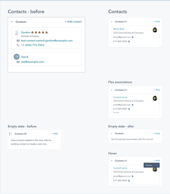
Charts pulled for original use of the association (right) sidebar on the record page.
Due to the amount of qualitative information we gathered in the activity section usability testing, increased quantitative usage data available for the record sidebars from analytics placed during timeline testing, and time constraints placed by product leadership for initial rollouts, we chose to forgo external user testing and learn directly from live feedback for the initial record sidebar design changes. While releasing any design changes without usability testing is risky, especially to such a high traffic area, most of our sidebar changes were based on small, straightforward features that were directly indicated by our data and enforcing more consistent design patters. I also made sure to get as much internal feedback as possible from internal HubSpot sales and support users, both the CRM Events and Records teams, associated stakeholders, and my CRM design team.
We found that no more than 4% of users were initiating calls or emails from association card links, so we lowered the visual prominence around that action and added quick-copy buttons to let users easily grab and utilize their contacts’ information for use in other tools. Only 2% of users were regularly expanding or collapsing the right sidebar, so we removed that functionality and gained back vertical real estate – in addition to significantly speeding up page load time. In our right sidebar association cards, like in the timeline, we took away icons to reduce visual noise and made further efforts to enforce consistent patterns in regard to the amount of data presented and the components used to do so.
As part of all of these changes, we removed a significant amount of white space. We took it from the margins within and between our timeline activities and association cards. We reformatted our profile highlight cards (shown right) to be left- rather than center-aligned. We enforced consistent font sizes and weights, which led to significant savings in line height.
The end result of this is that we not only made it easier for reps see more at once and scan across their record data, but we also decreased load time on the page, adding up to a noticeably faster experience across the board. For the more compact timeline events alone, we saw a 34ms improvement in loading individual events as compared to their legacy equivalents.
Handoff illustration for primary association cards (companies)
Handoff illustration for primary association cards (contacts)
Handoff illustration for profile card in property (left) sidebar
Handoff illustration for the property (left) and association (right) sidebar.
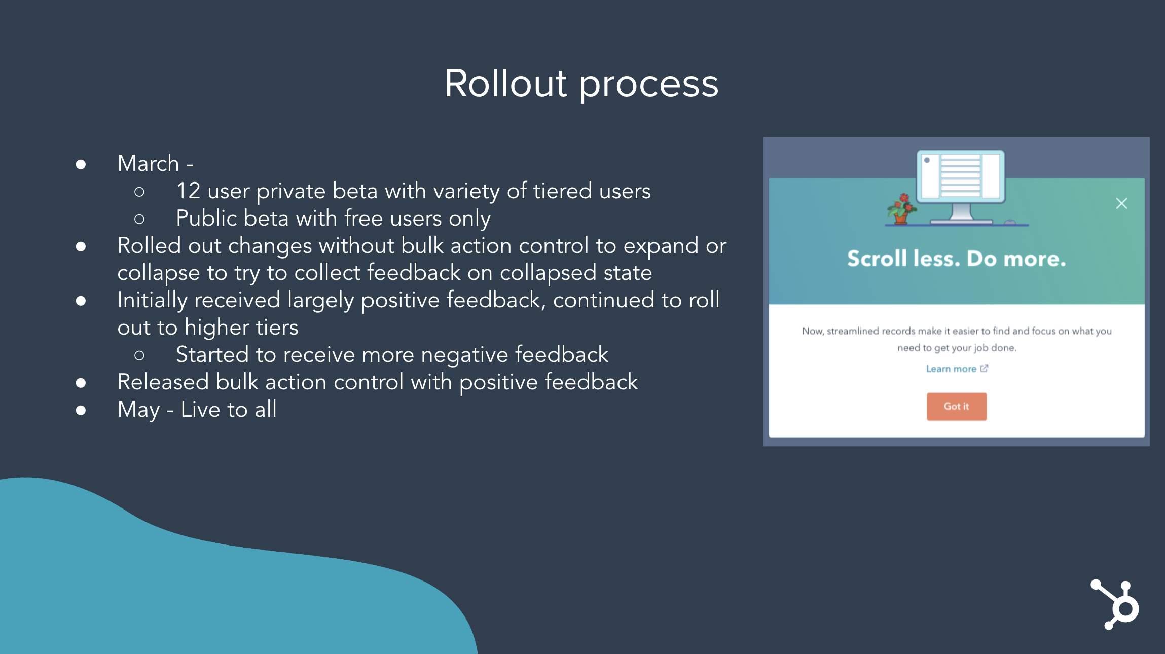
Rollout:
Initial rollout record page in May. Screenshot taken on a 13” laptop.
The results of the initial release period (March 9th - May 4th) were 47.58% positive, 32.44% neutral, and 19.98% negative from 3,000 CSAT survey responses, including 462 comments.
During the week of May 24th, we ran another CSAT survey to gauge how much change pain was a factor in initial results before releasing further design updates based on feedback.
We ran the same survey behind a gate and ungated users from portals who had previously responded to the survey so we would be working with the same cohort of users. We did not resurvey users who had previously responded to the survey.
We were pleased to see an 8% increase in positive survey responses and an 8% decrease in negative survey responses as compared to initial release period results.
The split of feedback during this round was:
Positive: 54.62%
Neutral: 32.92%
Negative: 12.46%
Again, we waited to collect data until we hit 3,000 responses.
The following slides are from a presentation that I created and delivered with my CRM Records PM, Dylan, at HubSpot Tech Talk, which is a weekly live presentation available to the entire company to highlight key product changes. I walked the audience through the basic design changes we had made to the record, and then together Dylan and I discussed our rollout process and learnings.
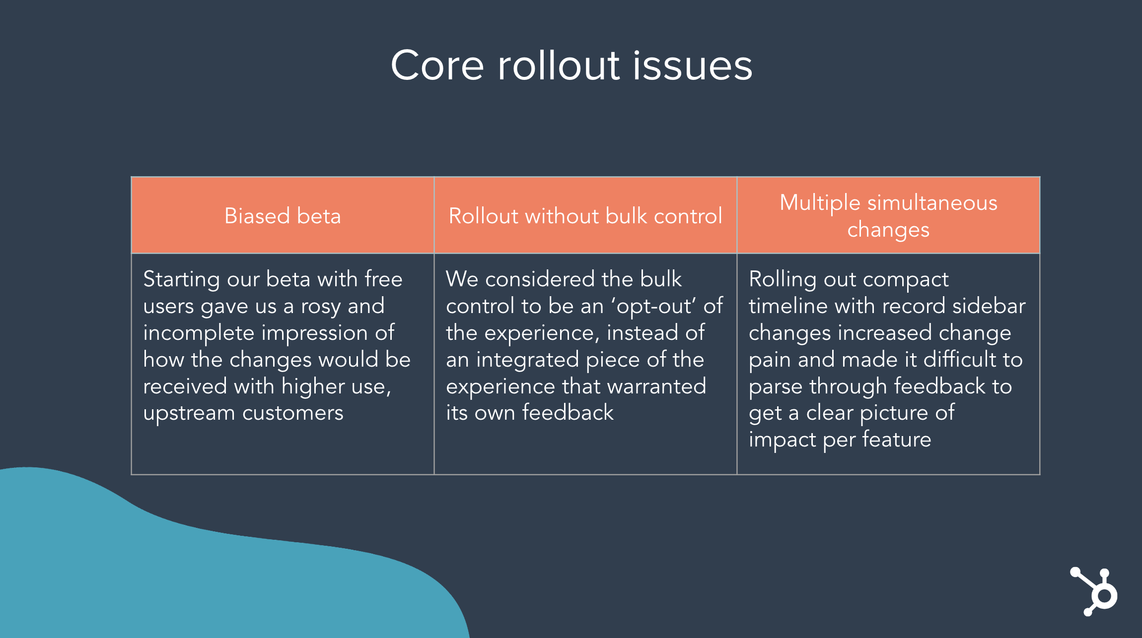


As a designer, going through this rollout process and learning where we fell short taught me a lot about rollout orchestration and about contributing a UX voice to the planning stage. While I absolutely believe that PMs should lead this effort, I learned to ask questions and deliver light feedback while they are in the preparation stage to make sure that important user groups are prioritized and change pain is mitigated where possible, much like PMs deliver feedback based on each iteration of designs. This experience highlighted for me that while the overarching design changes make the most impact over time, how the users receive those changes also makes a big impact on their workflow and general experience with your product.
—
The primary piece of constructive design feedback we received during this rollout was around the increased number of clicks users needed to perform to understand the gist of an event. In our efforts to streamline timeline events, we made things too compact. In response, we released an update wherein the primary activity types (email, calls, and meetings) had slightly more preview text in their collapsed state. We also released an update with the bulk ‘Expand all/Collapse all’ control at the top right of the timeline, which let users ‘Expand all’ for an experience that was closer to what they had been accustomed to. This is especially useful during the adjustment period to this new layout, given how strongly we had seen change pain impact users’ perception of the updates.
Secondarily, we had a number of users mention that it was more difficult to distinguish event types from each other without their icons. Again, most of this concern was mitigated as users grew more familiar with the design changes, but we wanted to honor the root of the feedback which was about users needing to be able to quickly find specific events and/or event types. We updated the search target to have its own input field at the top right of the timeline, which greatly increased visibility and usage. We also prioritized filter updates on our Q4 roadmap, in hopes that improved filters would help users toward this goal as well.
Mockup for core post-rollout design updates.
With all design changes released, the following are the results we saw as changed from the page’s original state:
Redesign of activity timeline reduced negative NPS comments by 75%
More discoverable activity timeline search functionality resulted in an 469% increase in weekly search usage from H1 to H2 and a 5.3% increase in search usage retention during the same period
Redesigned commenting feature saved customers 18 seconds per comment (x 349k comments per week)
The record data density initiative is part of a larger story. I collaborated with my two PMs to create an overarching strategy for how we wanted to approach iterative design for the record page, which is to cycle between the goals of 1) Drive clarity, 2) Increase relevance, and 3) Add data. As the deck below outlines, this project was our top priority for our ‘Drive clarity’ goal.
User journey map that I facilitated the creation of with my two product managers and a collaborating designer. This was the baseline for our 2021 strategy and is still used as an asset to help our teams to understand our users’ needs.