Record Vision
The Challenge: The record page (a ‘profile’ page for CRM objects such as contacts, companies, and deals) is the heart of HubSpot’s CRM, which is the heart of its platform. With over 100 million page views per month, it is the most visited page in HubSpot, serving as a nexus for an object’s properties, activity, related objects, tools, and apps.
As demonstrated in our new Sales Hub Usability Study, its structure no longer serves the influx of data and functionality that has been added to the record since it’s last major redesign. Our UX researcher boiled the record’s challenges down into the following three themes:
Scalability - Record pages aren’t scaling with the rest of our system
Orbital Usage - Sales reps are forced to navigate around the CRM in ways that don’t match their preferred workflows
Object Blurring - Sales reps are getting confused about where their information lives in the CRM across objects
Having worked on the record for ~2 years, I had been feeling these issues as well in conversations with users and our product teams. I helped advocate to prioritize this work so that we could visualize and gain alignment on a way to move forward into a more functional experience without feeling restricted by our current page structure, information architecture, and user interaction patterns.
Solving for: Primarily sales reps, but also support and service reps
Role: One of two designers tackling this project. When this work began in Q3, I was already set to switch to the HubSpot Commerce team the following Q1. Colin, my design collaborator on this project, had just been hired as my backfill. I was the primary designer on this project and was concurrently helping to onboard Colin, while he was more in charge of stakeholder management in order to start building relationships across our product. We worked closely with a UX researcher and content strategist.
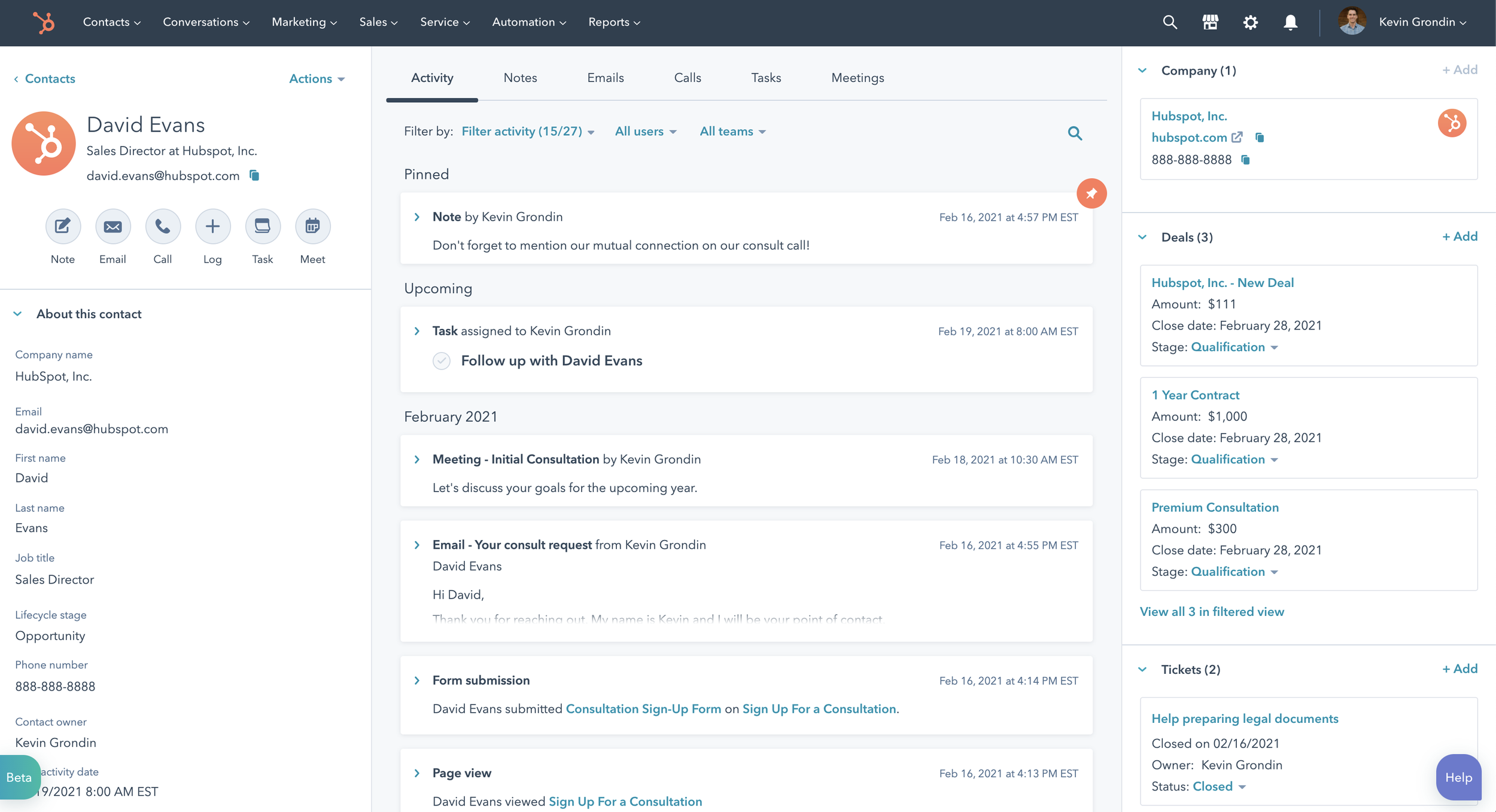
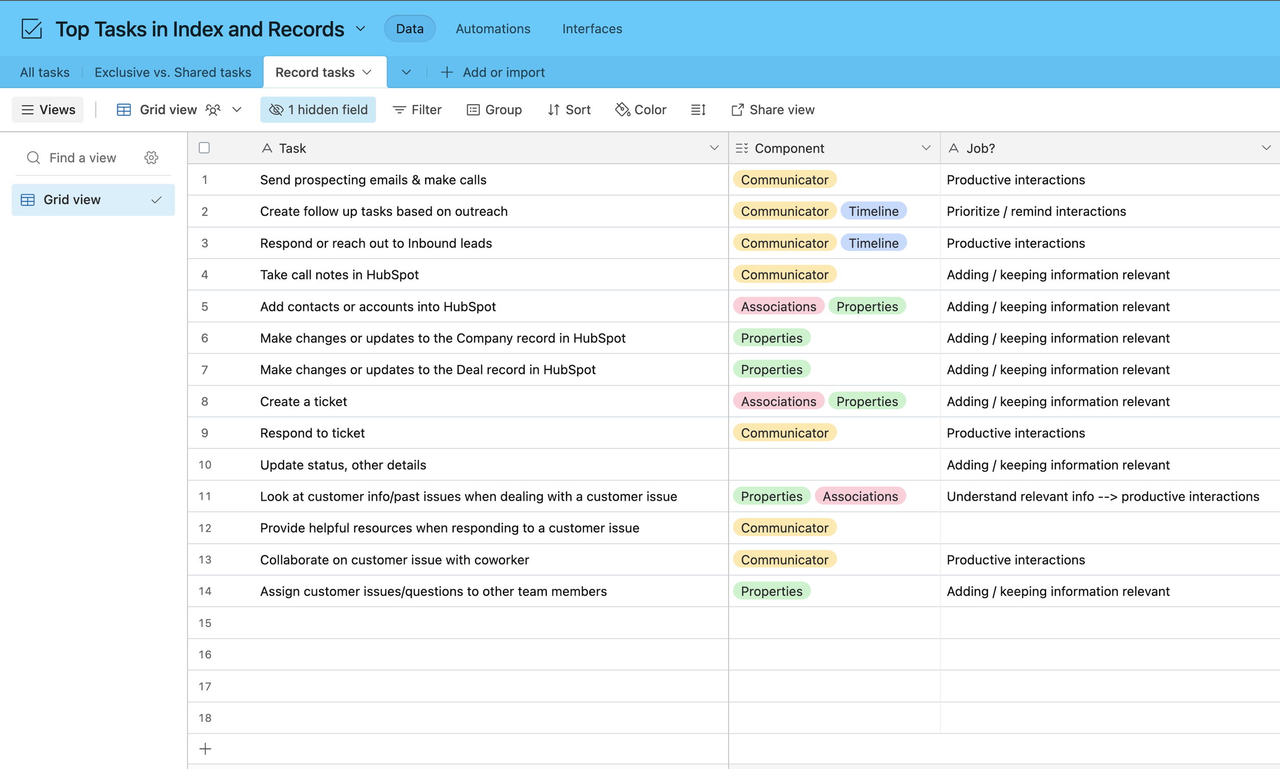
Original state of the CRM Contact record page
Examples of issues users were facing on the record:
Scalability
the default HubSpot records (essentially connected profile pages) are for contacts, companies, deals, and tickets. With Custom Objects, users could have a Drone or an Order object. The information needed on these objects are much less about timeline events, given that you can’t have connected engagements with/build relationships with these non-human entities. It is more important to utilize space on the page for these objects to represent properties, insights, and associations.
Orbital usage
to see associations beyond the 3 in the record sidebar preview, users would have to open a new tab to see those associations displayed differently in a table
when opening a record preview, have to navigate to that record in a new tab to log any sort of note or create an engagement in regards to that object, or to view that record’s recent timeline activity
Object blurring
users expect to find more information in place on their associations in the record sidebar and in general on the record preview
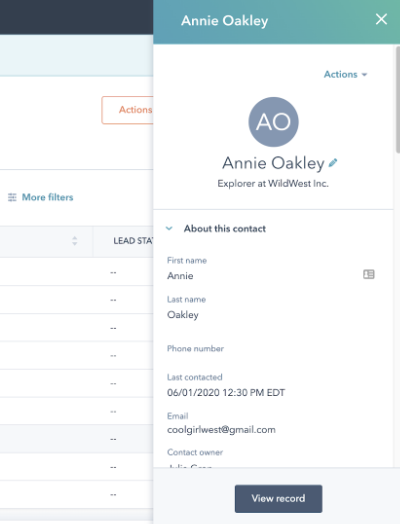
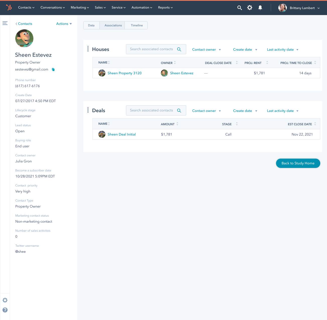
Original record preview sidebar
We started our project by hosting 2 workshops with individuals from 8 teams across HubSpot that worked on the record in order to generate quick hypotheses based on our established challenges. It was a great way to build up excitement, awareness, and feelings of ownership across these teams for this work. Our UX researcher developed the scenarios for the session, while I facilitated the activities.
We began with a ‘worst possible idea’ activity to get people comfortable generating ideas, and then split participants into groups to brainstorm and sketch solutions for different scenarios related to our known issues.
The following recommendations from team members in our workshop served as a jumping off point for our initial design sketches:
Move away from the 3-column record
Clearly mark what’s new or changed
Make it easier for reps to take action on records
Explore new adaptations and wayfinding patterns
Explore new views that relate objects to each other
Enhance customizations
Experiment with an intelligent assistant that follows reps as they use the CRM and guides them on the next, best actions they can take
Test different formats of record pages based on object type, deal stage, and other factors, some of which could be customizable
Explore means of bringing record info to reps wherever they are in the CRM rather than forcing them to go to a record
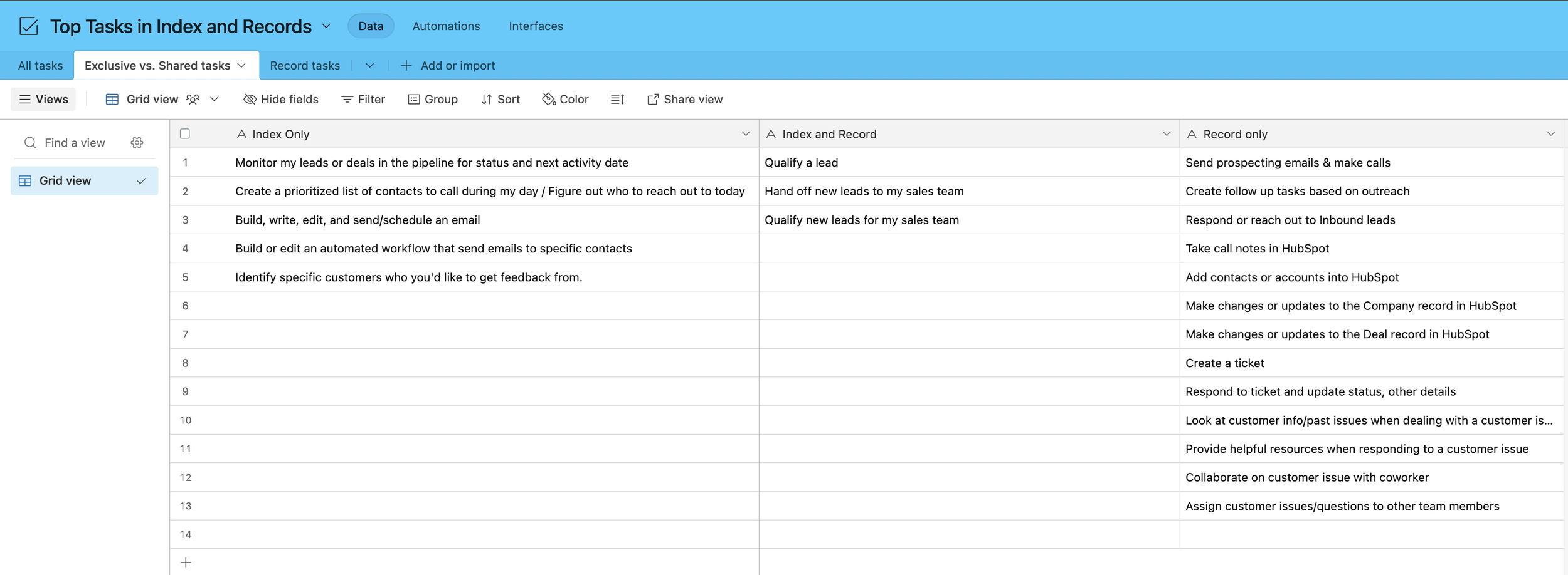
As an additional input before our sketching round, Colin and I organized top tasks for Sales and Service reps based on previously published research studies at HubSpot.


Colin conducted a brief competitive analysis.
Given my 2+ years being a primary designer for the record page, I was also able to incorporate my deep knowledge of our users’ needs and daily struggles into the below sketches that I completed for our initial design round.


After discussing as a working team, we decided to move forward with testing 3 layouts from my sketches. Our UX researcher took the lead on writing the research plan for our two-part, scenario-based cognitive walkthrough of these record design concepts.
Concept 1 - timeline
Concept 1 - data
Concept 1 - associations
Concept 2 - timeline
Concept 3 - timeline
Concept 2 - data
Concept 3 - data
Concept 2 - associations
Interestingly, the users in our research sessions validated many of the recommendations our team had surfaced in our earlier design workshop.
The most prominent finding from our research were:
users needed flexibility based on different object types
needed to be able to quickly find the most relevant/actionable pieces of information
the ‘most relevant’ information might not necessarily be the most recent touchpoint or input
We made one more round of designs based on our findings, choosing hold off on an additional round of concept validation in lieu of planning to test and hone individual features and functionalities as they’re added to roadmaps over the next year(s).
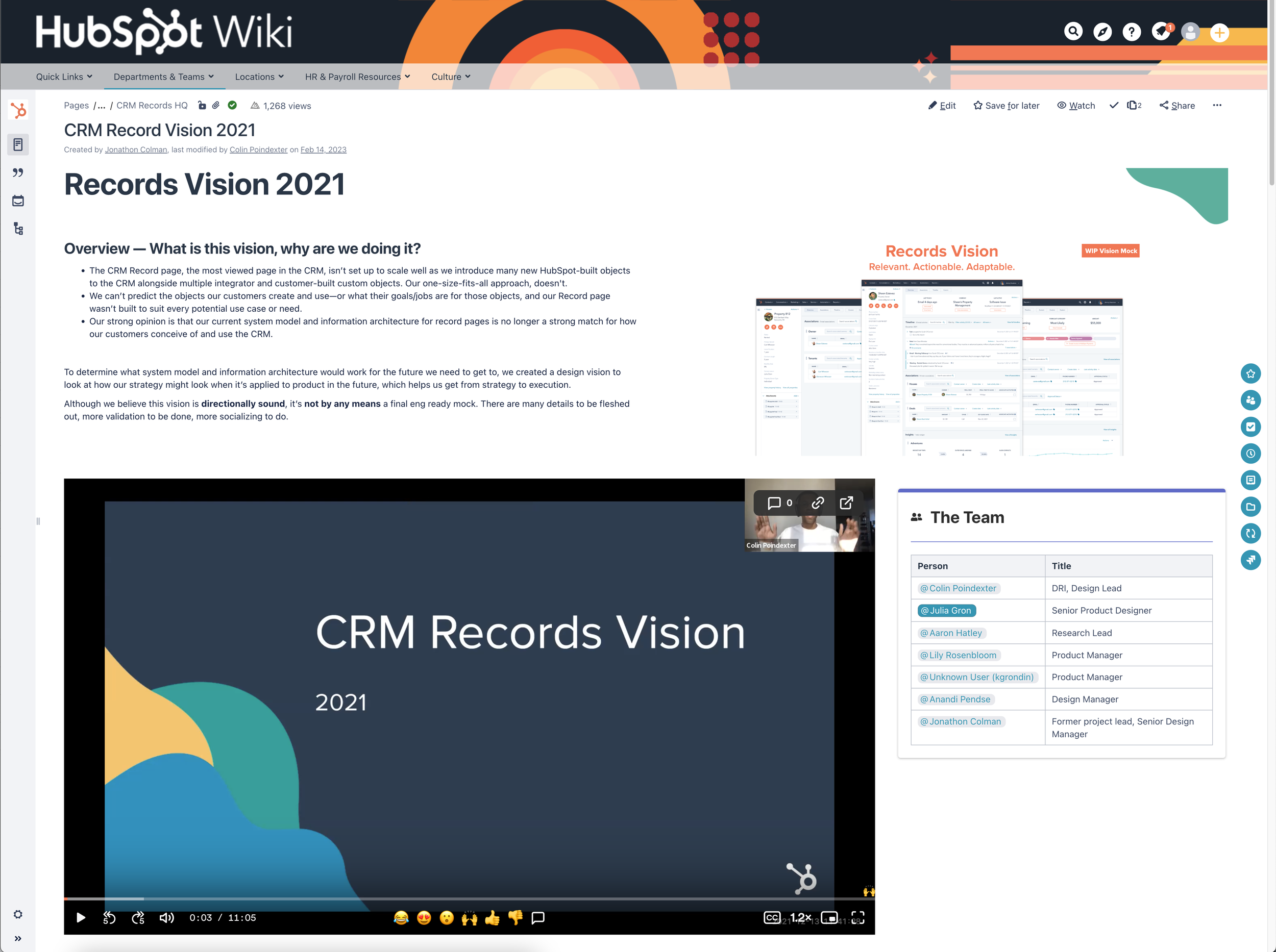
Our final designs can be seen in the below presentation I made with my co-designer, Colin. I walk through our proposed design changes from 3:50 to 9:10. We shared this loom across the organization to collect feedback and build awareness for where the CRM Record was headed.
Full, HubSpot public project writeup I wrote with Colin, socialized across the org, with leadership comments at the bottom:


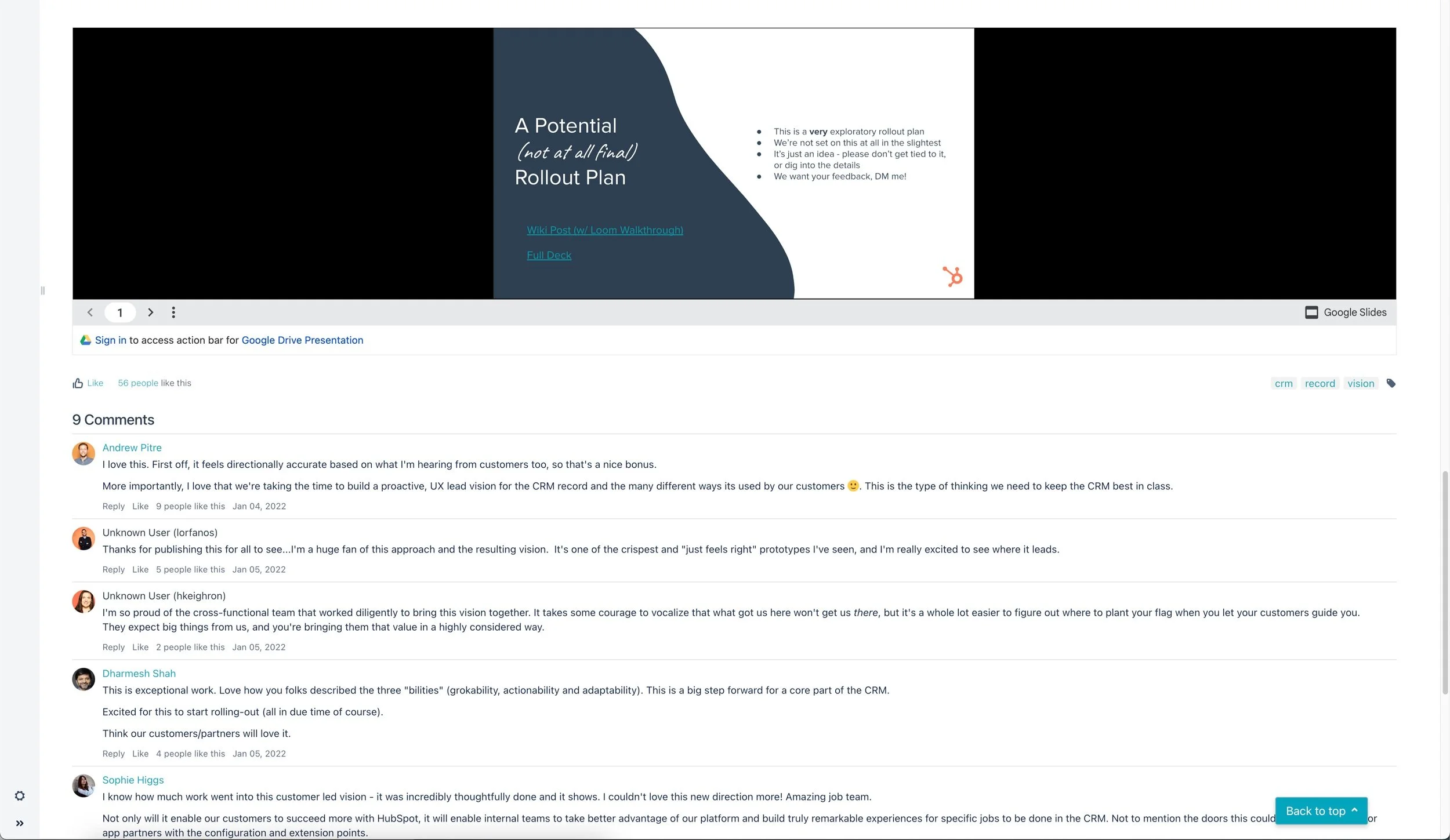
The work and alignment gained with this vision work helped to inform the following years of roadmap planning.
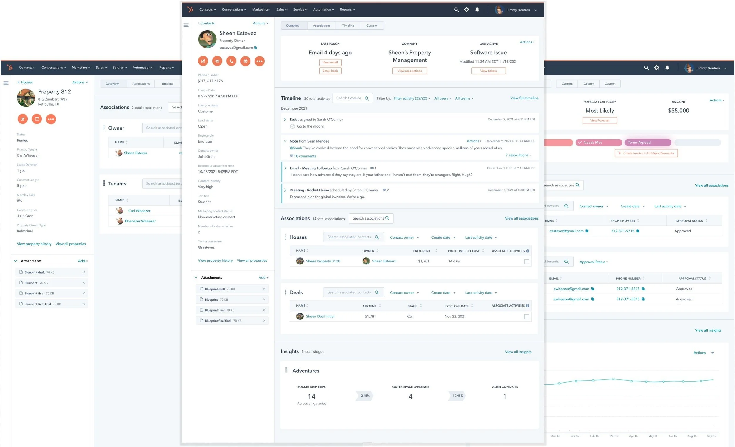
This project was completed EO 2021 into Q1 of 2022. Below are screenshots taken in September of 2025, where you can see many concepts from the vision realized into the live HubSpot product.
new record IA in the main portion of the record, including an ‘Overview’ tab, alongside the activities tab, alongside (potential) custom and intelligence tab
customizable data well at the top of the overview tab
associations displayed in search-enabled table format on the overview tab
expandable activity creator (instead of the option to pin activities, the option to re-order them)
mini timeline in the overview tab
ability to create engagements and see record timeline from the record preview


