Wayfair Enterprise: Onboarding Tutorials
Challenge: External suppliers who are new to any area on our PartnerHome enterprise platform require training, which is cost-intensive and difficult to scale when done through (often repeated) account manager calls. Suppliers need additional training as they continue to use our platform and new features are released.
Solving for: All Wayfair PartnerHome members
Role: Lead product designer collaborating with product management, engineering, content strategy, PartnerHome product design stakeholders, and design system leads.
Success looks like: Decreased time spent with account managers in manual training, fewer tickets submitted for (re-)training questions, positive qualitative feedback through suppliers and account managers.
To begin this project, I led a design workshop based on competitive analysis with my enterprise design team so that we could come up with a strategy and scope for this initiative. We began the workshop by going through competitor examples and discussing aspects of those that we thought would or would not be useful to our users. We then moved to a conversation about how to prioritize the training use cases for our platform, and then had two rounds of sketching and group discussion. The goals for the workshop and use cases discussed are as follows:
GOALS
Explore a template for training throughout the PartnerHome experience with the following guiding principles:
Function-focused: explains core functions of software and how to use them
Doing-focused: walks user through common tasks
Contextual & relevant: helps users to complete their immediate goals
Available for repeated viewing: for new users coming in using same account, returning users who have forgotten, etc.
USE CASES
New user walking through enterprise portal for first time
Existing user viewing a new workflow/page
Existing user viewing a new feature on an existing page
Existing user seeking training on pre-existing feature
Competitor examples discussed in the session, categorized by component type.
Aspects of competitive examples we thought could work for our Enterprise users.
Initial concept of scope and timeline for PartnerHome tutorials.
Formalized timeline for PartnerHome tutorials.
In our workshop we created a timeline for the scope of the tutorials initiative for the current and subsequent three quarters, moving from non-centralized, short form tutorials towards more centralized, long form training. We prioritized a tooltip to introduce a new feature on an existing page and a multi-step modal to train users on a new page or workflow as the the immediate design deliverables.
I ran through the same competitive analysis and our design workshop output with my development team and product management stakeholders to achieve alignment and kickoff the concept iteration phase of the tutorials design process.
Once development and product stakeholders were in agreement with our direction, I began to explore design concepts for the necessary components. My goal was to add a color to our design system that would be reserved for tutorials so that users could easily distinguish training content from the features they describe.


Initial color and design concepts for tooltip and multi-step modal.
Colors are mocked up with our notification red color for surfacing new content to users.
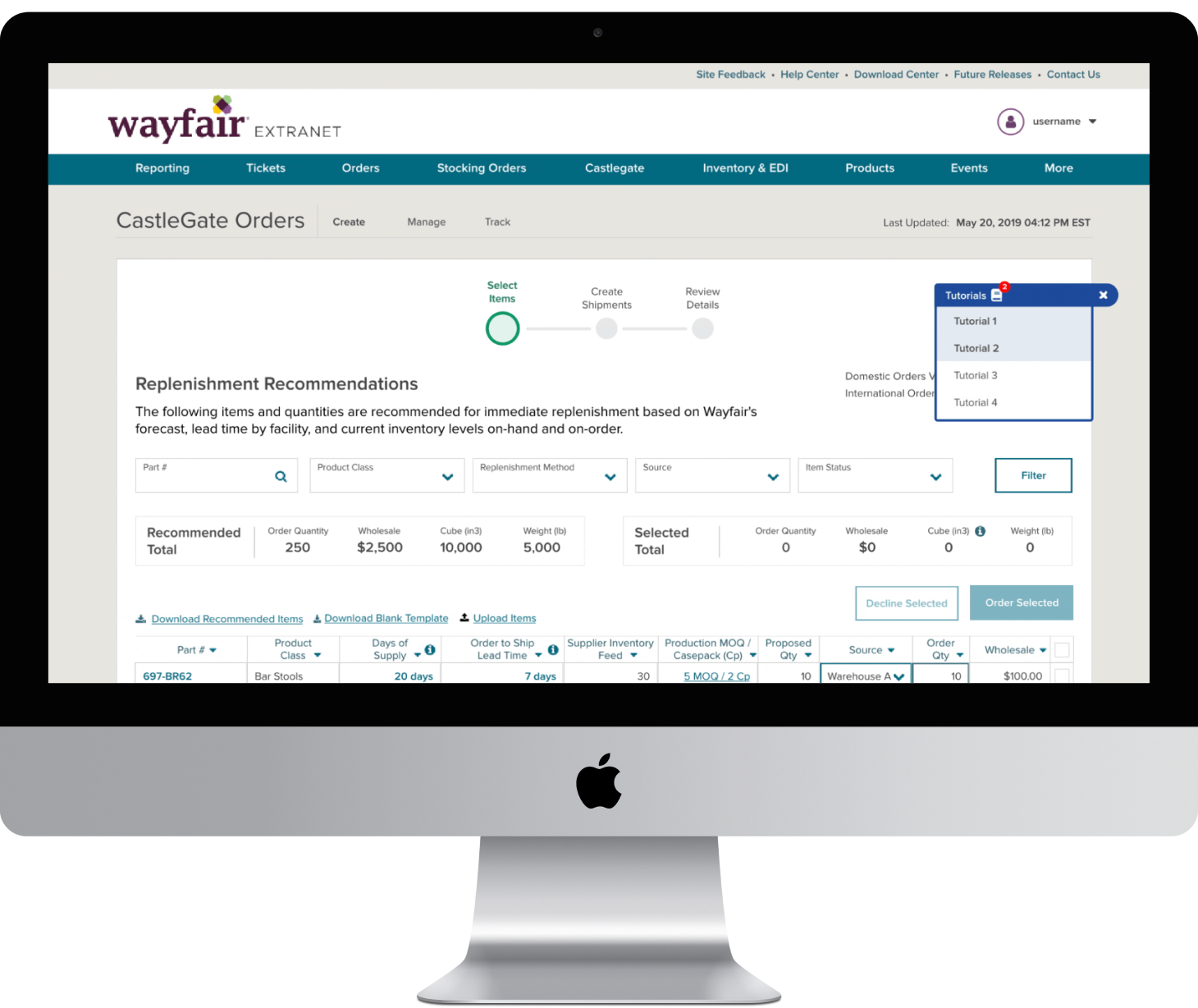
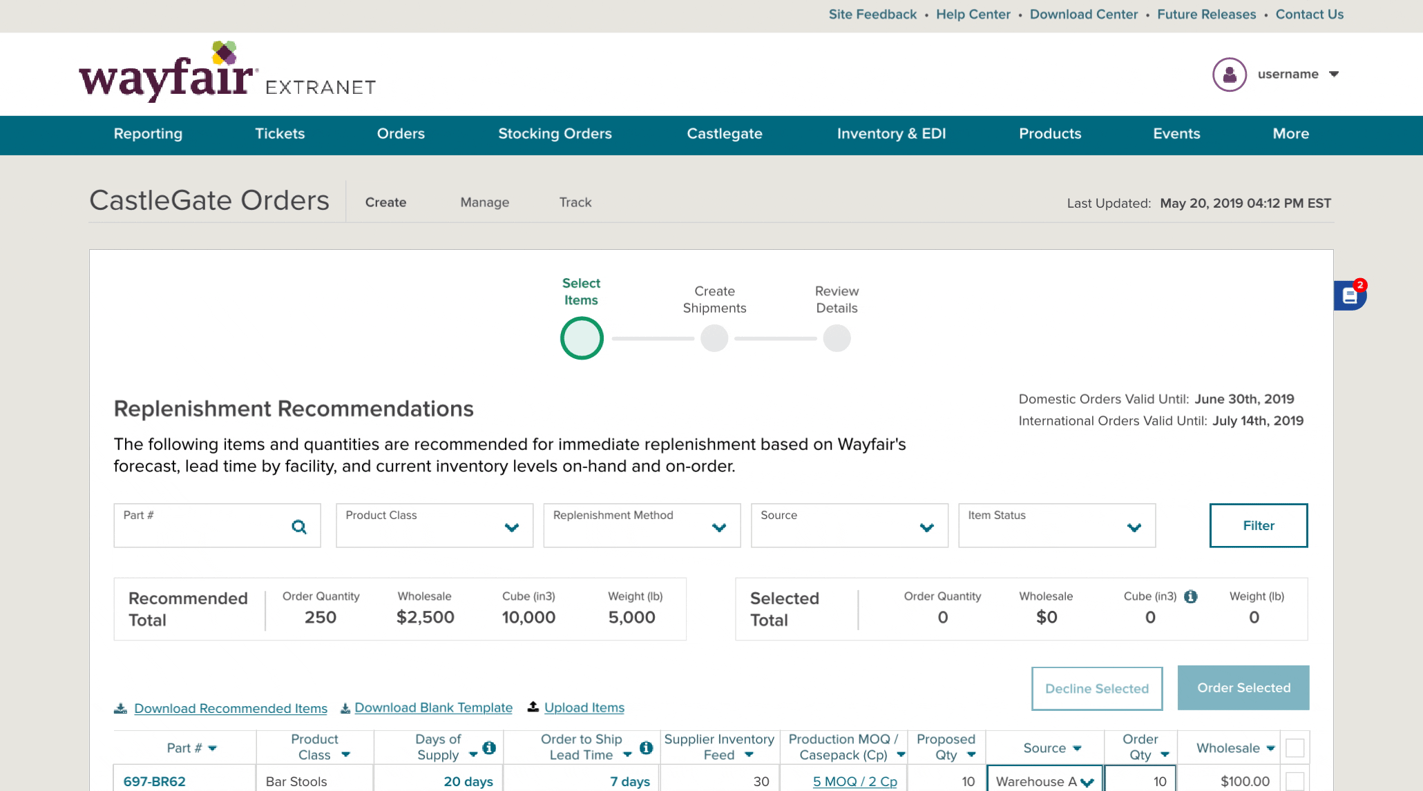
At this stage, I held a workshop with other design stakeholders on the PartnerHome team to ensure that these components fit all of their areas’ training needs. During our session we decided that our previous execution plan was missing a solution to walk users step-by-step through a complicated workflow, like uploading a product to our site catalog. I added an ‘action required’ variation of the tooltip component to fill this need (second row of tooltips shown below).
In order for this training paradigm to be consistent across our PartnerHome platform, I met with our design system team to arrange the collaboration necessary to have the new components built straight into our design system.

Final design of the tooltip components - passive tooltip (top) and action required tooltip (bottom).

Final design of the multi-step modal.
As part of the design system submission, I wrote the below usage guidelines for each component. I also worked in collaboration with our team’s content strategist to write content guidelines for all PartnerHome training.
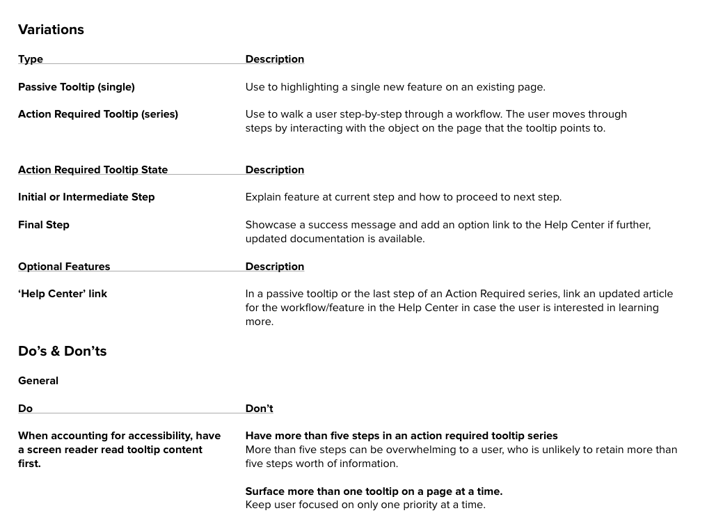
Tooltip usage guidelines.

Multi-step modal usage guidelines.
In the second workshop with design stakeholders on the PartnerHome team, we discussed the use case for ‘re-triggering’ training content – that is, allowing users to view training content at a time of their choosing. This is especially useful for our account managers who often navigate around our platform while on the phone with external suppliers, when they can’t take the time to go through and learn about new features.
To work towards a solution, I collaborated with designers from our service team to understand how to best address the needs of their primary users, account managers. Together we sketched out some options for tutorial re-triggering.


I created low-fidelity mock ups based on our sketches, and then animated our preferred solution to use in conversations with our engineering and product stakeholders.
Rough animation proposal for project stakeholders, made with Flinto. Component opens on hover and closes on click of ‘x.’