Wayfair Professional: Sitewide Navigation

Wayfair Professional is Wayfair’s B2B solution, offering exclusive products, prices, and services to qualifying members.
The Challenge: Wayfair Professional users come from multiple distinct industries (hospitality, education, etc.), and when browsing in a generic experience become overwhelmed and discouraged by how extensive the catalog is. These users need to be able to navigate within experiences tailored to specific industry and style needs.
Solving for: All Wayfair Professional members.
Role: Lead product designer collaborating with product management, engineering, content strategy, and external stakeholders (Wayfair Professional category management, VEST team, navigation team, Homebase team, site merchandising, business account managers).
Success is measured by/KPIs: session level conversion rate, add to cart rate per visit, navigation success rate (as defined by ATC), navigations per customer, average number of navigations before ATC, bounce rate, and product detail page view rate
The original navigation for Wayfair Professional is shown below. While some users with dedicated account managers were placed by those managers in our pilot Education- and Office-specific experiences, most of our users were unmanaged, and landed in our generic experience with an overwhelmingly extensive catalogue.

Original Wayfair Professional navigation.
The objective of the new navigation was to introduce a broader selection of industry experiences (adding Hospitality, Build & Renovation, and Trade to the existing Office and Education offerings), and have those available alongside our lifestyle brands accessible to all users at all times. Showing all options was an original high-priority request from the business, who felt that this functionality was a key differentiator between Wayfair Professional and our competitors. We wanted users to be able to self-select their needed experience, and had some early hypotheses that users may like to switch between experiences for various reasons, for example using their B2B account to shop for their personal home needs.
I began this exploration with a competitive analysis, paying special attention to sites that showcased multi-brand families.

Full list of competitive analysis navigation images here.
I also pulled competitive research from a competitor audit I had previously done (summary with recommendations available here, both referenced below).

I also worked with my PM and our analytics team to pull from the on-site analytics we had available.
Main recommendations:
Pull Orders out from My Account
at Wayfair, 2% of calls to BAMs are for small parcel order tracking and 15% are for large parcel order tracking
20% of calls to service desk are for order tracking
30% of items are re-orders
Link BAM information in nav so that users could more easily reach out and establish a relationship with our program
vetoed by product because of financial constraints that would arise if users notably increased calls to their BAMs, and because it was implemented in a previous test that lost
A primary challenge of this project was figuring out the proper organization needed to display all of the industry experiences and lifestyle brands in a way that categorized them by their option types - industry experiences which are curated in respect to professional space (ex. Education or Office) or role (ex. contractor for Build & Renovation, Trade), and lifestyle brands which are curated by aesthetic and price point. It was important to show these in respect to the hierarchy of Wayfair Professional as an umbrella to all experiences, while also including access to cart/account/my projects/orders which have a global scope.

User tested iteration of navigation, ‘Shop for Business’ tab open.
User tested iteration of navigation, ‘Shop for Home’ tab open.
The organization we settled on for the first version of this navigation was to separate options based on which spaces users were likely shopping for - business spaces (Office, Education, Hospitality) or residential spaces (lifestyle brands, Trade). We knew that this left some gaps, as contractors shopping Build & Renovation could also be shopping for residential projects and the Trade experience is distinct in look and feel and curation from the other lifestyle brands. Additionally, keeping Trade in the ‘Shop for Home’ section under the Wayfair logo (for verified trade users only) prohibited those users from seeing our B2C experience without logging out, which was useful for them to understand their discounts.
We also added a new box icon to represent My Orders, and changed Idea Boards, My Account, and Cart into icons in an attempt to reduce the overwhelm amongst so many text navigation options. I also changed the number on the cart badge to be a darker, accessible color.
We tested this version via a recorded user test on usertesting.com, and found that some users in the test were confused by the new box icon set to represent orders, and another raised questions about the trade experience living in ‘Shop for Home’ because they could use that curation to shop for a professional space as well.
Taking these considerations into account, we labeled the global icons and changed the category names to ‘Industry’ and ‘Residential.’
Before launch, I presented this navigation to B2B leadership and the VEST (Verticalization Experience SWAT Team, largely composed of category management stakeholders) team to gather feedback and drive consensus. I also worked with the Wayfair Navigation team and our Homebase design team to make sure that our vision aligned with in-house navigation and visual standards.
I also worked closely with BAMs throughout this process, listening in on customer calls to learn more about our users and testing the new navigation with the BAMs themselves. I recognized the BAMs as having the closest relationship to our customers and the most on-site experience of anyone else in the organization, and leaned on them for feedback and opinions.
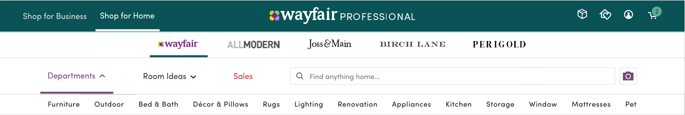
Below is the navigation version launched live to Wayfair Professional to desktop and mobile web, and remained the primary onsite navigation for almost 8 months. We knew that this was not the perfect solution, but wanted to release this functionality so that we could begin to learn about our users and how they would browse with these new options.


Analytics Report High Level Summary:
~20% of customers have switched between experiences and once users move they tend to stay in that experience
Users who navigate within their chosen experience are doing so more successfully (viewing more products and adding more to cart per navigation)
On a visitor level, we’re seeing a 2.8% increase in the number of classes viewed, indicating that we’re exposing customers to a wider range of products, which increases long term CLV
Users are navigating less often, driven mostly by search decreases (20% drop in search experiences). As a result, we’re seeing decreased user-level metrics across the board (decrease in the total items added to cart by user)
6.19% drop in navigation attempts per user, driven mostly by the drop in search
Desktop performance is far better than mobile; While desktop saw a 3.9% drop in navigation attempts per visitor, mobile saw a 25% decrease
Mobile PDP view rate is down 1.94%, and mobile ATC rate is down 3%
In regards to learning about shopping behavior of our users within these experiences, a primary learning was that trade users utilized cross-lifestyle brand navigation more than 2x as much as any other vertical.
Knowing this, my primary goals for the next iteration were to:
Highlight search
Treat the experience switch as more of a setting instead of an everyday action
Take up less vertical space on desktop and especially mobile web
I used a jobs-to-be-done approach in order to break down the tasks that this new header needed to accomplish.
Whimsical.co board available here.
Additionally, to help align stakeholders on the information architecture for the lifestyle brand and industry experiences choices, I mapped out the 3 distinct mental models from our group.
Whimsical.co board available here.
Assumption mapping exercise with VEST team to understand high-level key customer problems.
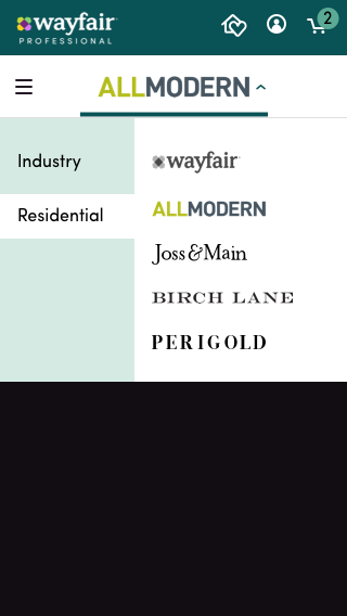
We ultimately landed on ‘Shop by Industry’ and ‘Shop by Style,’ with Interior Design available as an industry, and keeping the Wayfair B2C experience for Interior Design users as well alongside our lifestyle brands in ‘Shop by Style.’ Our content designers helped with the terminology, and this version by far had the most buy-in from our stakeholders.
Part of my hypothesis around lowered engagement with search on the previous version is that the search bar itself was surrounded by layers of choices, which could have overwhelmed users with clutter and cognitive load.
Though it was the original assumption that it was best to show all industry options available for feature and brand recognition, it is ultimately best for the business to have a less cluttered navigation that empowered users to search.
Recessed lifestyle brands and industry experiences, separated by center space.
Showing their chosen industry experience and lifestyle brand choices.
We chose to keep all options available to users to give them the highest chance of shopping in the correct experience for themselves, and also for brand visibility. Instead of persistently showing all options, I explored tucking them away into an organized dropdown.
Usertesting.com highlight reel for this version is available here.


Interior Design option exclusively visible to Trade/Interior Design users.
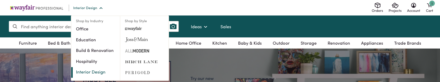
Interior Design option exclusively visible to Trade/Interior Design users.
We went through a round of usability testing with this version and saw a much better reception with our users. I also took this version through rounds of feedback with my engineering team, the design team, my PM, and the BAMs.
Notable changes to the new iteration:
Flyout design and new IA for options
Increased contrast behind search bar
Accessible and contextual search suggestion text
Using onboarding to treat experience change as a setting rather than an everyday activity
Invision prototype available here
I adapted this same onboarding paradigm to mobile and app as well.
Mobile web onboarding - invision prototype available here.
Wayfair app onboarding - Invision prototype available here.
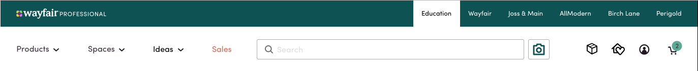
I also implemented the rest of the major changes to the desktop navigation to the mobile web navigation, as shown below.
Mobile web navigation - invision prototype available here.
The analytics report for the desktop refresh (without the onboarding) is as follows (users with onboarding had even more increased metrics):
Session level CVR is up 7.06% compared to control (excludes 4% of test sessions which navigated cross store).
ATC Rate (6.02%) and PDP View Rate (0.5%) are also both up significantly
Nav success rate, as defined by an ATC, is up 8.02%
Navigations per customer are down 4.29%, which could mean customers are finding the right products quickly.
Average number of navigations before ATC is down 2.18%, also indicating users are getting to the right products faster
**All metrics are within 99-99.9% significance